Exploring the 2011 Massachusetts
Travel Survey
Focus on Journeys to Work
Project Manager
Bill Kuttner
Project Principal
Efi Pagitsas
Graphics
Kim DeLauri
Cover Design
Kim DeLauri
The preparation of this document was supported
by the Federal Highway Administration through
MHD 3C PL contracts #32075 and #33101.
Central Transportation Planning Staff
Directed by the Boston Region Metropolitan
Planning Organization. The MPO is composed of
state and regional agencies and authorities, and
local governments.
April 2014
The household travel survey is a basic tool for transportation planning. The information about household characteristics and travel patterns provides the basis for travel demand model development as well as for studies of aspects of regional travel of topical interest. Information gathered in the recently completed Massachusetts Travel Survey supersedes data from the previous survey, undertaken in 1991.
Data-gathering technology and the needs of regional planning have changed significantly since 1991, which limits the range of direct comparisons that can be made between the two surveys. This analysis addresses this problem by strictly defining one particular class of trips: the journey to work, defined as any group of trip segments that begin at a primary residence and end at a primary workplace. By focusing on the journey to work, staff calculated a number of direct comparisons between the two surveys. Staff also developed a more detailed analysis of current commuting using the 2011 survey.
The report begins by analyzing the composition of regional households with respect to workers, trips to work, and auto ownership. It then estimates the total number of weekday journeys to work by six travel modes. Then the report describes travel to work via these six modes according to the key characteristics of each mode.
Table of contents Page
1.2 Comparing the 2011 and 1991 Surveys
1.4 The Importance of Journeys to Work
1.5 Notes on Tripmaking Terminology
2. Households, workers, and journeys to work
2.1 Household Characteristics and Auto Ownership
2.2 Workers and Journeys to Work
Households Reporting a Journey to Work
Individuals Reporting a Journey to Work
Trips in Households Reporting a Journey to Work
Journeys to Work and Total Regional Travel
3.2 Single-Occupant Vehicle (SOV)
Geographical Distribution of SOV Commuting
Intermediate Stops and Indirect Distance
Retrospective: Comparison with the 1991-HTS
3.3 High-Occupancy Vehicle (HOV)
HOV Commuting Reported in the 2011-MTS
Intermediate Stops and Indirect Distance
Retrospective: Comparison with the 1991-HTS
3.4 Drive-Access Transit (DAT)
Intermediate Stops and Indirect Distance
Retrospective: Comparison with the 1991-HTS
Intermediate Stops and Indirect Distance
Retrospective: Comparison with the 1991-HTS
Journeys to Work and Connecting Segments
Reported Walking Distances by Mode
4.1 Summary of Selected Findings
4.2 Possible Follow-on Analysis
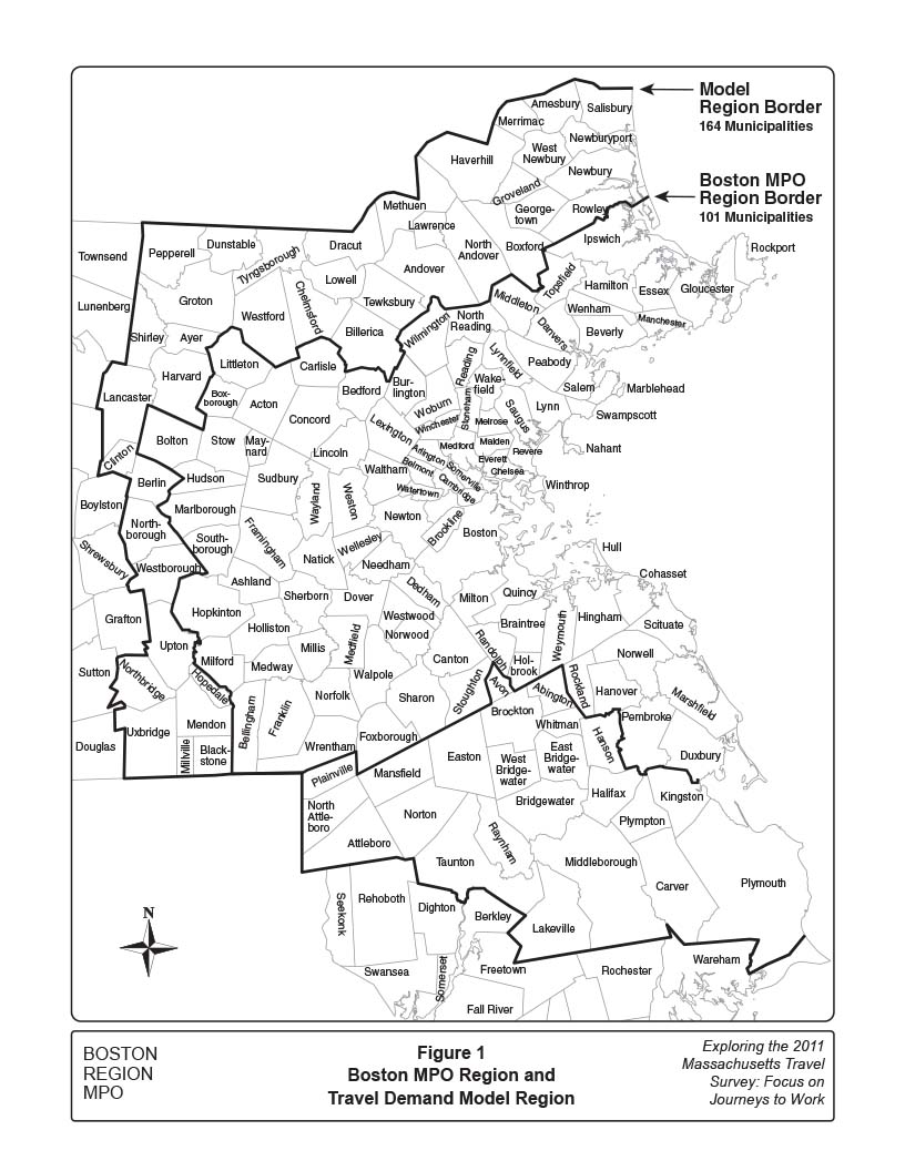
FIGURE 1. Boston MPO Region and Travel Demand Model Region
FIGURE 2A. 2010 Regional Households by Household Size
FIGURE 2B. 2010 Regional Population by Household Size
FIGURE 3A. Regional Households by Household Auto Ownership
FIGURE 3B. Regional Population by Household Auto Ownership
FIGURE 4A. Regional Households by Workers and Household Auto Ownership
FIGURE 4B. Regional Population by Workers and Household Auto Ownership
FIGURE 5. Households with Workers Reporting a Journey to Work
FIGURE 6. Percent of Regional Working-age Residents Making a Journey to Work
FIGURE 7. All Trips in Households Reporting a Journey to Work
FIGURE 8. Schematic of Typical Trip Chains
FIGURE 9A. Journey-to-Work and Journey-to-Home Trips
FIGURE 9B. Total Regional Trips
FIGURE 10. Modes Shares, Average Distances, and Commuting Miles
FIGURE 12. SOV Journey-to-Work Miles by Home and Work Sector Combinations
FIGURE 13. Composition of HOV Journeys to Work
FIGURE 14. Drive-Access Transit (DAT): Using All Modes
FIGURE 15. Walk-Access Transit (WAT): The Cachement Area
FIGURE 16. Walk and Bicycle: Journeys to Work and Connecting Segments
The Massachusetts Travel Survey surveyed 15,040 Massachusetts households during a 17-month period. Completed in fall, 2011, this project, referred to as the 2011-MTS, compiled information on households, individual household members, and all their travel activity on an assigned survey day. A summary of survey results is available at: www.mass.gov/massdot/travelsurvey.
Household travel information provided by surveys such as the 2011-MTS is essential for the development of the travel demand models used by the Boston Region Metropolitan Planning Organization (MPO). Travel demand models are used to predict how regional transportation systems likely would function in the future under various transportation-investment or demographic-trend scenarios. Measurements and analyses derived from these models include transportation system usage and levels of service, types and quantities of vehicle emissions, and socio-economic measurements such as environmental justice.
Prior to the 2011-MTS, the regional travel demand model was based on the 1991 Household Travel Survey (1991-HTS). Travel behavior and patterns gradually evolve, and the 2011-MTS updates 20-year-old data with more recent information. But not only is the 2011-MTS data more current, the scope and design of the newer survey also brings other advantages and new capabilities for MPO model development.
The 2011-MTS was a much larger effort than the 1991-HTS. Not only did it survey households throughout the state, but within the MPO model region it surveyed over twice as many households as did the 1991-HTS. As a statewide survey, it provided much more information about travel into and out of the model region than was previously available. The new survey also collected data on pedestrian and bicycle modes more systematically and in greater detail, which has already provided a more complete picture of how the non-motorized modes are used.
The 1991-HTS was designed to support the development of the then-current travel demand models. Traditional travel demand models, using earlier generations of computing power and associated software, sought to accurately represent the travel activity of large groups of people in the model region—a model structure sometimes referred to as an “aggregate” model.
The 2011-MTS anticipated a new generation of travel demand models. With the computing power and software available today, travel demand models can simulate the travel patterns of individuals. The motivation for an individual’s daily travel is seen as a sequence of “activities,” and this approach is referred to as “activity-based” modeling.
The different requirements of the two surveys can be illustrated by comparing a few of the reporting practices. In the 1991-HTS, respondents carried a travel diary throughout the survey day and characterized each location by one of a small set of pre-defined activities. The next activity was always at a different location and the travel between these locations was characterized by mode and end-to-end travel time. Grouping the 1991-HTS responses by traffic analysis zone and household type served as the basis for estimating the aggregate travel demand models used by the Boston Region MPO.
The 2011-MTS obtained activity and travel data in significantly greater detail than did the 1991-HTS. A much larger set of activity options was offered, and respondents could report changing activity without changing location. Trips requiring use of multiple modes and transfers between transit lines had a separate response for each trip segment. To facilitate this more detailed reporting, about one-half the participating households received direct follow-up phone calls to retrieve the day’s travel information.
The fundamental differences in the two survey efforts limit the range of direct comparisons that can be made between them. A number of significant comparisons can be made, however, by focusing on one set of important and clearly defined trips: the journeys to work. The goals for this study are to:
In this study, the journey to work is defined as travel on the survey day from the respondent’s primary residence to his/her primary workplace. All intermediate stops such as picking up or dropping off a passenger, changing modes, or some other activity are counted as part of the journey. The wording of questions and requested information were not identical for the 1991 and 2011 surveys, and reliable comparisons between the two surveys should not be assumed. By chaining all reported trip segments between primary residence and primary workplace it is possible to develop two consistent sets of travel information from which a number of reliable comparisons can be calculated.
A later section will show that journeys to work, together with the reciprocal journeys to home, comprise only 25 percent of regional trips on an average weekday. These trips cover one-third of the distance traveled in the region, however, and are concentrated during the AM and PM peak periods. The daily journeys between home and work largely establish peak-period capacity requirements, and both cause and respond to peak period congestion.
All other regional travel, while representing 75 percent of trips, covers only two-thirds of distance traveled in the region and is spread more evenly over the weekday. Important travel destinations outside the daily commute include shopping and social, recreational, or personal trips. People making these trips include workers not working on the survey day, those making an extra trip outside of their regular commutes, and non-workers.
Journeys to work also relate closely to land use. Major housing developments and concentrated employment centers will generate reasonably predictable numbers of journeys between home and work. Other land uses also generate significant numbers of trips, but their amounts often reflect characteristics of the development, such as whether a family restaurant is located at a mall or by itself.
The various parts and purposes of travel by individuals can be described or classified in various ways. These terms are often assumed to have specific meanings, but can reflect something slightly different given the analytical needs of a particular task. This section presents a few of the commonly used terms, indicating where there is some flexibility in usage. This study will define trip terms as they are being applied wherever they appear in the report text.
A trip is travel between two activities. Changing modes is not considered an activity. Dropping off or picking up passengers is sometimes considered an activity. Sometimes activities lasting a short period of time, like stopping at a convenience store for less than five minutes, are not counted as distinct activities.
If more than one mode or transit vehicle is used to make a trip, the different parts of the trip are referred to as unlinked trips. Combining several unlinked trips to cover the entire distance between two activities forms a linked trip, a term usually shortened to just “trip."
One or more sequential trips can be defined as a trip chain. The journey to work and journey to home are often trip chains, with workers stopping to shop or perform other errands either on the way to work or home.
A tour is a type of trip chain that returns to its place or origin. The journey to work is at the front end of a tour.
Anything reported by a 2011-MTS respondent as part of the journey-to-work chain is counted as a segment. In this context, segments can refer to activities, mode changes, and even reported waiting periods.
There are 101 municipalities in the Boston Region MPO. To properly characterize travel in the region, however, a travel demand model covering 164 municipalities has been developed. Most of the commuter rail lines serving metropolitan Boston extend outside of the 101-municipality MPO region, making numerous stops in these neighboring 63 communities. Also, this 164-municipality model region includes the entire Interstate 495 corridor. Given the importance of this expanded model region, all model development work is undertaken at a uniform high standard across all 164 communities. The 2011-MTS was designed especially to estimate a new model set across this 164-community area. Of the 15,040 households surveyed statewide, 10,407 of these lived within the 164-municipality model region. These two regions are shown in Figure 1.
The 2010 Census reported 1,671,000 households in the 164-community model region, about 72 percent of which lived within the 101-community Boston MPO region. The model region population was 4,458,000, of which about 71 percent lived in the Boston MPO region. This implies average household sizes of 2.67 and 2.62 residents for the model and MPO regions, respectively—figures only slightly smaller than those reported in the 2000 census. The more-expensive housing stock in the 101-community area may explain part of this small difference.
Model Region Boston MPO Region
Municipalities 164 101
Population 4,458,000 3,162,000
Households 1,671,000 1,205,000
Average Household Size 2.67 2.62
Both the 2011 and 1991 surveys built their statistical samples around households. This is standard practice for regional travel surveys because groups of households characterized by size, available cars, and numbers of workers are known to share important travel characteristics, especially the numbers and types of trips a household would be predicted to make. For this reason, the demographic forecasts developed for future years on the planning horizon must forecast household sizes.
In building a survey sample on the basis of households, important information was obtained about participating households for the 13 Massachusetts planning regions, which is summarized and available on the 2011-MTS website cited above. Selected information from these regional summaries has been combined for the 164-municipality model region and is presented here.
FIGURE 1.
Boston MPO Region and Travel Demand Model Region
The average annual household income in the model region is about $78,000. The median is somewhat lower, with about half of the households reporting income of less than $71,000 per year, and half reporting more. Income levels in the region are slightly higher than reported statewide. Statewide, 20.4 percent of households report income of less than $25,000 annually, compared with 18.1 percent in the model region. Similarly, 29.4 percent of households statewide report incomes exceeding $100,000 compared with 32.1 percent in the model region.
Model Region Statewide
Household income exceeds $100,000 32.1% 29.4 %
Household income less than $20,000 18.1% 20.4 %
One-fourth of the region’s residents are less than 20 years old, almost identical to the statewide portion. The region has fewer residents older than age 65, at 12.5 percent, compared with 13.5 percent for the state.
The ethnic composition of the model region and statewide households is similar. About 86 percent of households characterize themselves as “white,” both in the region and statewide. Also statewide and in the model region, about five percent and two percent characterize their households as “black,” and “two or more races,” respectively. About one percent of households declined to answer.
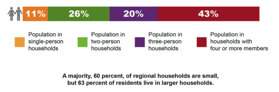
While households and their characteristics are the basis for building the survey sample, the travel activity that the survey measures, and which this report analyzes, is made by individuals. While socio-economic data is obtained on a household basis, the larger households, on average, will generate more travel; and this can be depicted graphically by weighting the households by their size.
This is illustrated in Figures 2A and 2B. The survey sample matched the regional population, with 28 percent of households having only one person and 32 percent having two persons. One can generalize and say that 60 percent of households are these smaller households, as shown in Figure 2A.
Figure 2B has the same household size categories, but shows the fraction of the model region population residing in each household size. Only 37 percent of the population lives in the smaller households, while 20 percent lives in three-person households and 43 percent in households with four or more persons. Ultimately, reported travel will be roughly proportional to the breakdown in Figure 2B.
FIGURE 2A.
2010 Regional Households by Household Size
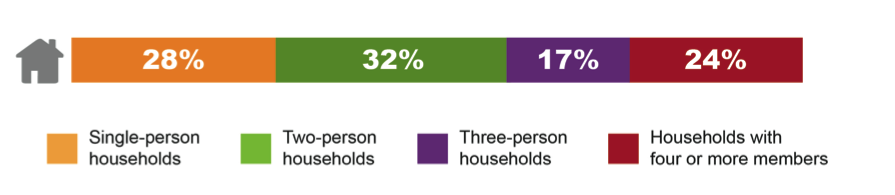
FIGURE 2B.
2010 Regional Population by Household Size
The most important household characteristic with respect to travel behavior is auto ownership. The prevalence of auto ownership in the region is illustrated in Figures 3A and 3B, each figure showing three groups according to household auto ownership. Figure 3A resembles Figure 2A in that it groups households according to auto ownership. Figure 3B groups residents by household auto ownership.
As shown in Figure 3A, most households have at least one auto. Almost half of the households, 46 percent, have at least one auto per person. For households with less than one auto per household member, the average is 0.51 autos per household member.
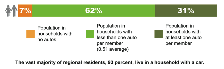
Dividing the population by auto availability presents a somewhat different picture, as shown in Figure 3B. The 13 percent of households without a car contain only seven percent of the region’s population. This is understandable since smaller households may find it easier to “get by” without an auto. Also, dividing the cost of an auto between members of a smaller household effectively increases the vehicle cost per person.
At the high end of auto ownership, the households with at least one car per member are smaller, adult-only households. Most residents of households with younger children are part of the 62% with less than one auto per household member. Still, almost a third of the population lives in a household where there is an auto for each resident.
FIGURE 3A.
Regional Households by Household Auto Ownership
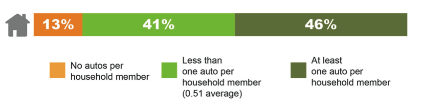
FIGURE 3B.
Regional Population by Household Auto Ownership
Auto availability is especially strong when compared with the numbers of workers in households. As shown in Figure 4A, 22 percent of regional households have no worker. Five percent of regional households have a worker but no auto, seven percent have less than one auto per worker, and 66 percent of households have at least one auto per worker. For households with less than one auto per worker, the average household has 0.54 cars. The 66 percent of households with at least one auto per worker have an average of 1.33 autos per worker.
Figure 4B allocates the regional population to these four household groups. The 22 percent of households without a worker tend to be smaller and contain only 15 percent of the population. This makes sense since larger households likely would have at least one worker. Another group of smaller households have a worker but no auto, containing only four percent of the regional population.
The 73 percent of households with both a worker and a vehicle (Figure 4A) contain 81 percent of the regional population (Figure 4B). Most of these households have at least one car per worker, the average being 1.33 autos per worker in these auto-rich households. In the smaller group of households with more workers than autos, the average is 0.54 autos per worker. This high level of auto availability in households with workers has important implications for journeys to work.
FIGURE 4A.
Regional Households by Workers and Household Auto Ownership
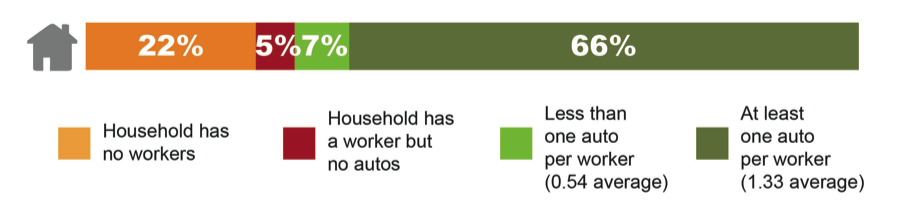
FIGURE 4B.
Regional Population by Workers and Household Auto Ownership
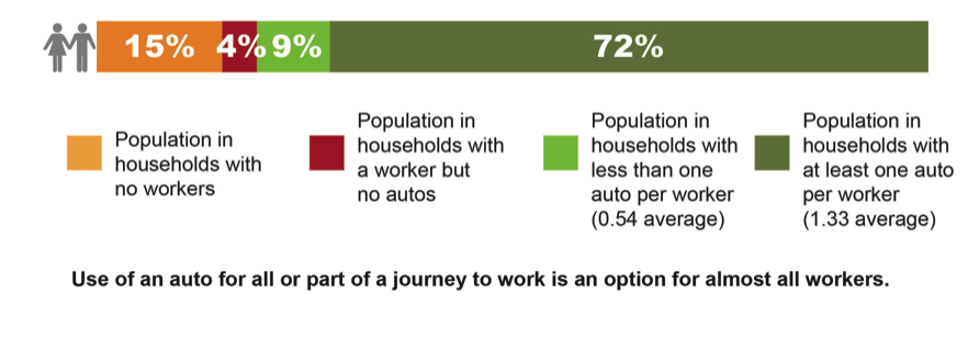
Figure 4A shows that 22 percent of regional households have no worker. The remaining 78 percent of households that have a worker is shown in the upper bar in Figure 5. This chart is the starting point for discussing journeys to work.
Of the households that report having a worker, not all of them will report a journey to work on the day of the survey. The lower bar in Figure 5 shows the 64 percent of regional households that report a journey to work on the survey day.
The difference between households with workers and households reporting a work trip on the survey day has several explanations. The 2011-MTS respondents reported that their average scheduled workweek was 4.6 days. About seven percent also reported that their standard practice is to work at home. These two factors explain almost half the difference between the two bars.
FIGURE 5.
Households with Workers Reporting a Journey to Work
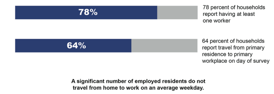
In addition, many five-day workweeks include Saturday and Sunday, and the survey day may have been a worker’s day off. Vacation, sick days, occasional work from home, or travel to a work-related destination rather than the primary workplace on the survey day also help explain the difference.
While seven percent of respondents report that their usual practice is to work at home, about one-fourth report that their employers allow telecommuting. A similar number of respondents report that their employers have flextime options; and about 80 percent utilize some type of flextime option where available.
The next step in analyzing journeys to work is to convert households reporting journeys to work to individuals commuting on a typical weekday. The 2011-MTS limited its work-related questions to respondents at least 16 years of age. As shown in Figure 6, 73 percent of working-age residents live in a household reporting a journey to work. Figure 5 showed that only 64 percent of households reported a work trip, which implies that these households are on average a little larger. This is understandable since larger households are more likely to have a member reporting a journey to work on the survey day.
Figure 6 further subdivides the population in households where a journey to work takes place between members making a journey to work and members who don’t. Of this group, 56 percent make a journey to work. The remaining 44 percent either are workers not making a journey to work for one of the reasons mentioned above, or they are not currently employed. This would include homemakers, most high school students, and retired spouses of workers, to name just a few categories. The 27 percent of households not reporting a journey to work also may include workers not making a work trip on the survey day for the aforementioned reasons.
FIGURE 6.
Percent of Regional Working-age Residents Making a Journey to Work
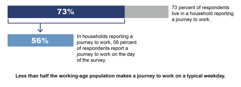
The 2011-MTS did not count unemployed residents as workers, even if they considered themselves part of the labor force and were actively looking for work. Unemployment was relatively high in both Massachusetts and the model region during the 17 months of the survey. If unemployment had been lower, the percentages in Figures 5 and 6 of households with workers, households reporting work trips, and individuals making work trips would have been incrementally higher.
Of the working-age population, only 41 percent make a journey to work on a typical weekday. This is derived by taking the 73 percent of residents who live in households reporting a work trip and multiplying it by the 56 percent of people in these household actually making a journey to work.
All trips by working-age residents in households where a journey to work was reported are represented by the upper bar of Figure 7.
FIGURE 7.
All Trips in Households Reporting a Journey to Work
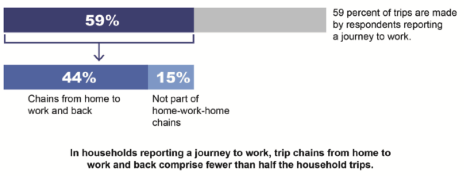
Of these trips, 59 percent were made by a household member who made a work trip, and 41 percent were made by other household members. This 59 percent of trips corresponds to the 56 percent of household members making a journey to work shown in Figure 6. On average, household members making work trips make slightly more trips each day than the other household members.
Over the course of the survey day, these trips can be grouped into several distinct chains or tours. The subject of this report, the journey to work, is all the trip segments from the primary residence to the primary workplace. Together with the reciprocal journey to home, travel from home to work and back makes up on average about three-fourths of the trips that a commuter will make on a typical workday. The lower bar in Figure 7 removes the trips not part of the journeys to work and back, and illustrates that even in households reporting a journey to work, the journeys between home and work comprise less than half the trips.
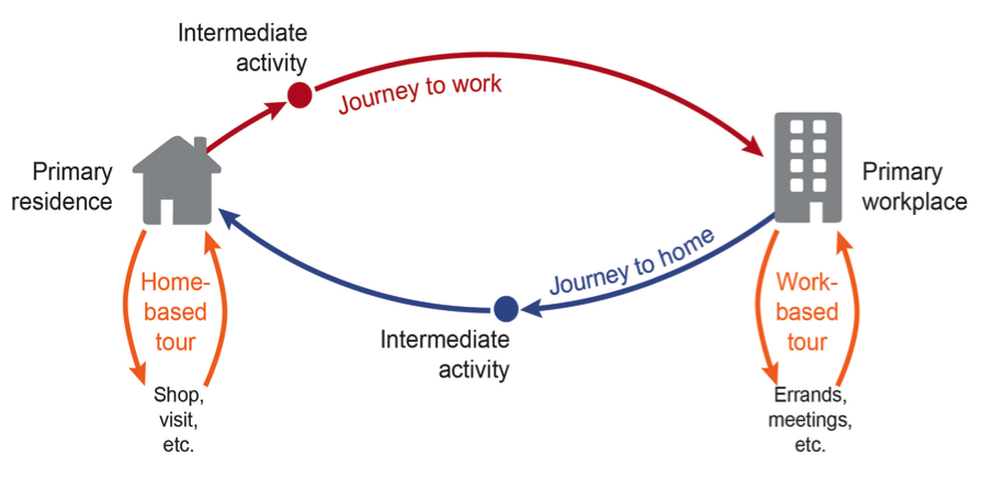
Trips not part of the journey-to-work or journey-to-home chains fall into two groups: home-based tours and work-based tours. In home-based tours, the respondent travels from home to one or more consecutive activities, not including the primary workplace, and then returns home. All travel by individuals not reporting a journey to work falls into this group.
Many respondents reporting a journey to work also make home-based tours at the beginning or the end of their workday. In addition, they may make work-based tours, such as leaving their primary workplace to go to lunch, shop, or visit a client before returning to work. Together, trips chained in these home- and work-based tours make up on average about one-fourth of the trips of a respondent reporting a journey to work. Figure 8 shows these types of trip chains schematically.
FIGURE 8.
Schematic of Typical Trip Chains
Journeys to work and to home are frequently punctuated with an intermediate stop for some activity. Figure 9A illustrates the frequency of stops in addition to arriving at work or arriving home. Over the course of the journeys to work and home, about 21 percent of the stops will be at some activity other than home or work. As the chart clearly illustrates, intermediate activities are a more frequent part of the journey home than of the journey to work.
FIGURE 9A.
Journey-to-Work and Journey-to-Home Trips
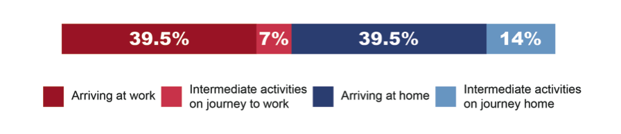
FIGURE 9B.
Total Regional Trips
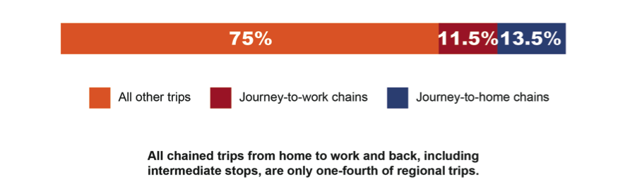
Figure 9B depicts all trips in the model region, only about a quarter of which are part of the chains between home and work. The chained trips between home and work are on average 48 percent longer than trips not part of these chains, and represent one-third of the region’s travel miles. Considering that these trips are heavily concentrated during the morning and evening peak periods, it is apparent why they receive so much attention in the planning process.
Modes, like trips, can be defined different ways. Defining travel modes requires particular care if more than once physical mode can be used to make a trip, such as driving to a transit station. In this study, the mode definitions also need to describe journeys to work that include intermediate activities that divide the journey into multiple trips.
For this study, the mode designations used in the Regional Travel Demand Model provide a practical set of definitions by which all the reported journeys may be characterized. Keep in mind, however, that these mode designations are being applied to chains of trips rather than reported individual trips. The six mode definitions used in this study are:
In the SOV mode, the respondent drives alone over all trip segments from primary residence to primary workplace.
In the HOV mode, the respondent is in a private auto on all segments of the journey, and may be the driver or a passenger. If the vehicle has two or more occupants for any segment of the journey, the journey is designated as HOV. If the journey consists of chained trips, some of these trips might be considered individually as SOV, but in this study the entire journey is designated as HOV.
In the DAT mode, the respondent uses both auto and public transportation to make the journey from primary residence to primary workplace. If the respondent starts the journey with public transportation then is picked up and driven to work, that also counts as DAT. The occupancy of the auto providing the access is not considered.
In the case of WAT, public transportation is the only powered mode. The respondent walks (or bicycles) to reach the transit service, and then again to reach the workplace at the end of the transit segment.
All trip segments are made by walking.
All bicycle journeys are either entirely by bicycle or may include a walk segment.
The use of the six modes in daily journeys to work is summarized in Figure 10. The vertical axis of this chart ranges from zero to 100, and reflects the journey-to-work mode shares by the six modes. The horizontal axis shows the average direct-line journey-to-work travel distance by mode. The vertical dashed line is placed at 8.9 miles and represents the average journey-to-work travel distance of all six modes combined. As Figure 10 illustrates, commutes by SOV and DAT are longer than the regional average commute distance, while the other four modes serve shorter average commutes.
FIGURE 10.
Modes Shares, Average Distances, and Commuting Miles
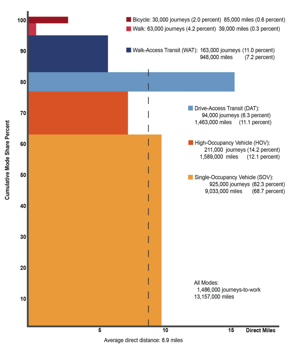
The colored rectangle of each mode represents the portion of regional commuting miles covered using each mode. Journeys to work, journey-to-work miles, and the respective mode shares have also been placed near each mode’s rectangle.
The rest of this section discusses each mode individually, focusing on travel characteristics especially relevant to the particular mode. The frequency and purpose of intermediate stops are presented as well as estimates of additional travel distance required to make these stops. Appropriate comparisons with the 1991-HTS also are presented.
The expanded surveys in the 2011-MTS suggest that each weekday there are about 1,486,000 journeys to work by residents of the model region, and that 925,000 of these are made by SOV. The 62 percent SOV mode share is largely a result of its flexibility. The commuter drives from residence to workplace, regardless of where these are located. Any intermediate stops in an SOV commute are made at the discretion of the commuter. The geographical flexibility of the SOV commute is the focus of the SOV mode profile.
The 164-municipality model region is shown in Figure 11. For this study, the region has been divided into eight analysis sectors: a central sector consisting of Boston and nine adjoining communities, and seven radial sectors. In this analysis, journeys to work are characterized by type of sector-to-sector travel. The six sector-to-sector combination groups are designated as:
Both home and workplace are located within the central sector.
Both home and workplace are located within an individual radial sector.
Home is located in a radial sector and work is in the central sector.
Home is located in the central sector and work is in a radial sector.
Home is in a radial sector and work is in an adjacent radial sector. Journeys to workplaces outside the model region are included in this group if the external area is adjacent the home sector.
Home is in a radial sector but work is in a non-adjacent radial sector. A journey to a workplace outside the model region is included in this group if a radial sector must be crossed to reach it.
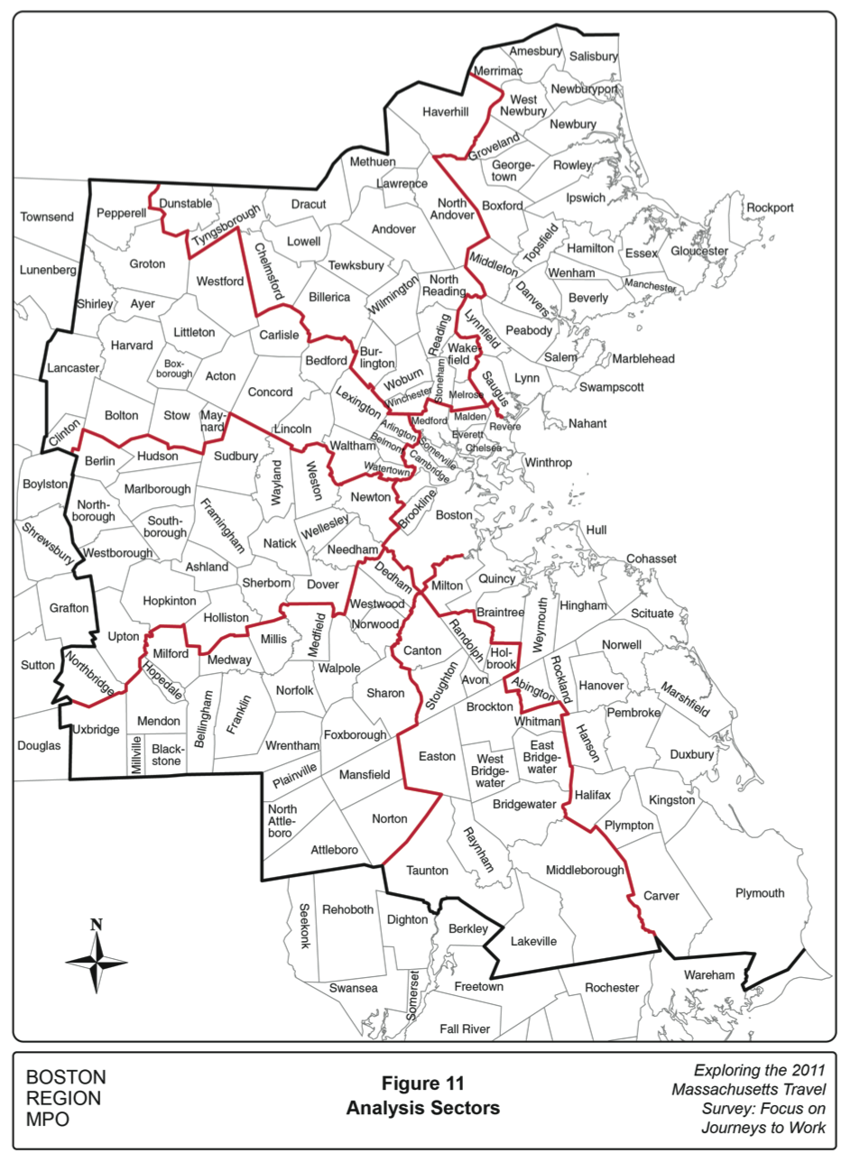
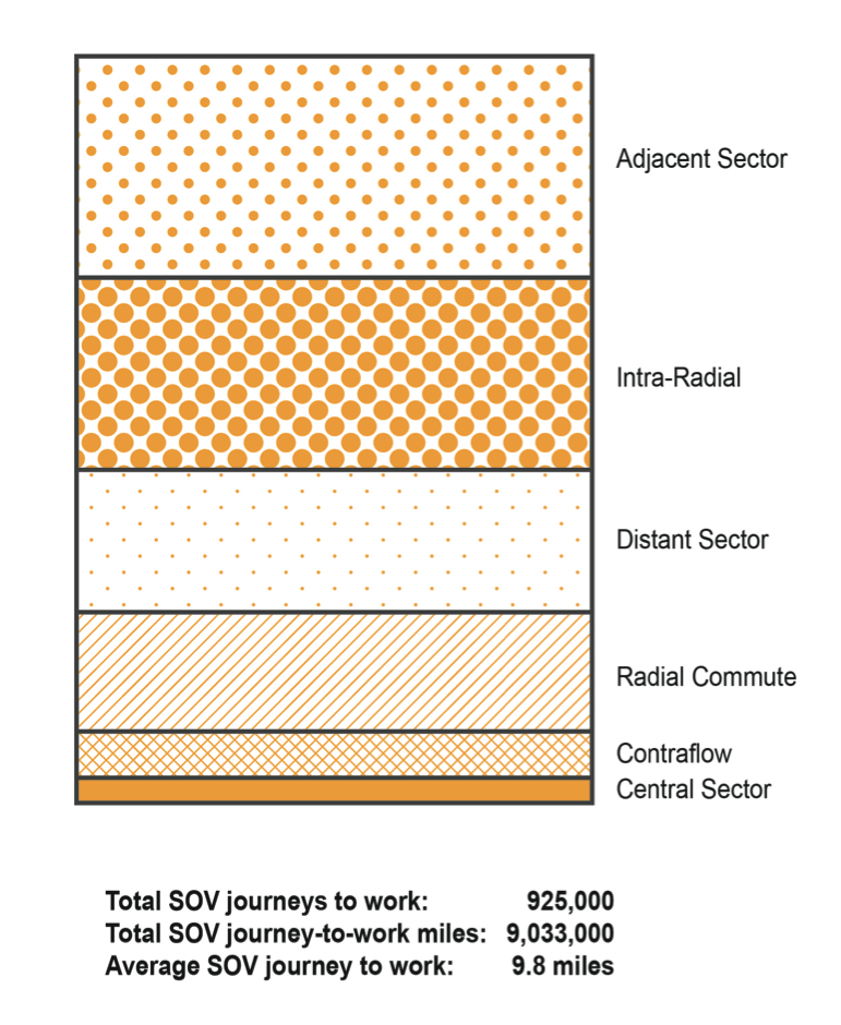
Figure 12 shows graphically the 9,033,000 journey-to-work miles by SOV generated by each sector-to-sector combination group. The rectangle in Figure 12 (identical to the SOV rectangle in Figure 10) is split into six slices that are proportional to the commute miles traveled in each sector combination group. The sector combinations are arranged in descending order of journey-to-work miles generated by the group.
The largest portion of miles, 27.8 percent of journey-to-work SOV miles, is for commutes between adjacent radial sectors. These commutes make up only 20.5 percent of journeys to work, and the average direct journey distance is 13.2 miles.
Commutes that begin and end within the same radial sector account for 25.1 percent of SOV journey-to-work miles, but account for 45.4 percent of journeys to work. This results in a relatively short average commute distance of only 5.4 miles.
These difficult commutes account for 20.8 percent of SOV commuting miles, but only 8.2 percent of the journeys, resulting in an average commute distance of 24.8 miles.
The stereotypical radial commute from suburban residence to downtown work is only the fourth-largest block of SOV commuting miles, representing 16.8 percent of miles. These are only 12.2 percent of journeys to work, resulting an average distance of 13.5 miles.
Commutes from homes in the central sector to jobs outside the sector make up 7.0 percent of SOV commuting miles and represent 5.5 percent of SOV commutes. This under-appreciated class of commutes contains an average distance of 12.2 miles and has important implications for radial highway peak-period capacity utilization.
Commute trips beginning and ending within the central sector represent only 2.5 percent of SOV commuting miles but are 8.2 percent of SOV journeys to work. This results in an average commute distance of only 3.0 Miles.
FIGURE 12.
SOV Journey-to-Work Miles by Home and Work Sector Combinations
No intermediate stops between home and work were reported by 86 percent of respondents. The other 14 percent of respondents reported stopping for an average of 1.3 additional activities. One-fifth of these stops were to get something to eat, followed by 19 percent of stops related to work, 17 percent to shop, 12 percent for household errands, and nine percent at a service station. The remaining 23 percent were distributed across various activities such as medical appointments and visits to the gym.
The journey-to-work distances presented so far have all been direct-line distances between primary residence and primary workplace. These distances measure the geographical dispersion of housing and employment opportunities and can be applied uniformly to reported travel in both surveys, including travel to workplaces outside the model region.
With the reporting of intermediate stops, it is possible to refine the travel distance estimates by adding together the straight-line distances of all the reported trip segments. In the case of the SOV mode, the average journey-to-work distance calculated in this manner is 10.5 miles, 0.7 miles longer than the average direct distance. Some of this added distance results from the need of some commuters to make a major detour, such as to visit a client. In other instances, the stop, such as for gas, is on the path of the regular commute. The reporting of the stop at the service station on the day of the survey simply adds an additional coordinate with which a total travel distance can be calculated.
Using direct-line journey-to-work distances from the 1991 and 2011 surveys, the average SOV commute distance increased from 8.7 to 9.8 miles during the 20‑year period. This change was the result of several trends. The fraction of trips in the shorter distance sector combinations, central sector and intra-radial commutes, declined from 58 to 54 percent of commutes, while the share of distant sector commutes increased from six to eight percent. Also, the average distances of radial and contraflow commutes increased by about one mile.
The HOV mode is often associated with two related transportation issues: the eligibility criteria for use of so-called “HOV lanes,” and the formation of daily commuting carpools. HOV lanes in Boston and elsewhere allow use by buses and limousines. While these are important services and meet the HOV lane eligibility criteria, they are not part of the HOV mode as analyzed in the 2011‑MTS.
Survey respondents who have formed a regular carpool will appear in the 2011‑MTS. They will report that a portion of their journey to work is in an auto with at least a second occupant who is not a household member. The respondent will not report, however, whether the shared travel on the survey day was part of a regular carpool or is an occasional lift to work or some other instance of travel with a non-household member.
The 2011-MTS does provide useful information about the role of the HOV in the journey to work. Several key findings are illustrated graphically in Figure 13. The HOV rectangle from Figure 10 is replicated at the top of Figure 13, and is split between the 81 percent of respondents reporting travel only with a household member, and the 19 percent that report travel with a non-household member. The trip purpose of the non-household member was not asked, and these 19 percent include purposes other than going to work such as parent carpools for bringing children to school.
FIGURE 13.
Composition of HOV Journeys to Work
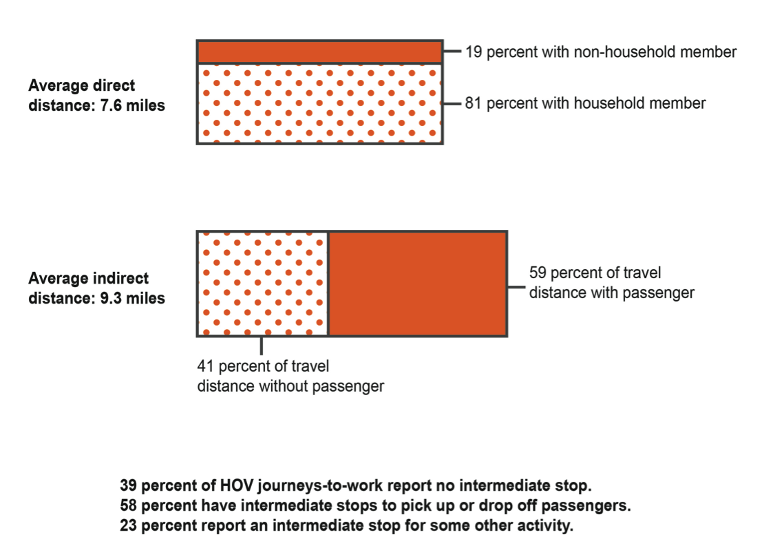
Of the 81 percent of commuters sharing a ride for part of the journey with a household member, about 16 percent of these are household members making journeys to work together. This may represent the largest set of formal daily commuting “carpools.”
The intermediate stop is clearly an important and complex aspect of the HOV mode. Picking up or dropping off passengers usually implies some deviation from the most direct commute. Furthermore, implicit in the process of picking up and dropping off vehicle occupants is the fact that a portion of an HOV journey to work is likely to be without a passenger.
The second, longer HOV rectangle in Figure 13 is scaled to represent the average indirect distance of 9.3 miles, 1.7 miles longer than the average direct distance. All reported journey-to-work trip segments can be grouped according to whether or not there is a second person in the car. Applying the distance formula to each of these segments gives the result that 41 percent of the distance of HOV journeys to work is with only the driver.
The journey to work by HOV was without an intermediate stop in 39 percent of commutes. In these cases, the respondent would either be traveling with a household member or picked up by a non-household member. Most, but not all, of the remaining trips (58 percent) reported a stop to pick up or drop off a passenger. Occasionally, an HOV would stop for an activity without changing occupancy.
In addition to stopping to pick up or drop off passengers, HOV respondents reported stopping for a large number of intermediate activities. In aggregate, the number of intermediate activities equaled 23 percent of the number of journeys to work, exceeding the extra stops reported by SOV commuters. The distribution of these extra activities is similar to that of SOV commuters: 21 percent work related, 20 percent to get something to eat, and the rest divided between shopping, errands, medical appointments, and other personal business.
Both the direct and indirect HOV journey-to-work distances show little change between the 1991 and 2011 surveys. However, the portion of the total journey without a passenger, reported as 41 percent today, was only 28 percent of the travel distance in 1991. Even accounting for differences in practices by survey respondents, this appears to be a significant difference in the structure of HOV journey to work today as compared with 20 years ago.
The mode with the longest average commute distance is DAT. The other notable feature of this mode is that all modes and submodes are mentioned by survey responses. In its most common pattern, a DAT commute consists of driving from home to a parking lot at one of several transit submodes, parking, and then using the transit service. One or more transit transfers may be required, and then often a final trip segment on foot is reported.
Because it is common to transfer between different transit lines and services, the designation of a transit submode is actually a way of grouping various transit travel options into a limited set of pre-defined submode combinations. Five transit submodes have been defined for the purposes of this study:
Commuter rail is the only transit service utilized.
Both commuter rail and one or more additional transit services are used. The order of the several transit boardings is not relevant.
The commuter uses the Red, Green, Orange, or Blue lines. The journey may include bus segments, but not commuter rail or ferry.
Bus is the only transit service utilized. Travel on private regional carriers or employee shuttles are included with this submode definition.
A ferry service is utilized. The journey may include rapid transit or bus segments.
The mode shares of the DAT submodes and the average travel distances of the connecting modes are depicted graphically in Figure 14. The rectangle from Figure 10 is replicated at the top of Figure 14. This rectangle has been divided to represent the shares of each transit submode used by DAT commuters.
The importance of commuter rail to the DAT mode is evident; commuter rail is used in 55 percent of DAT commutes. It is noteworthy that a majority of these commuter rail users can get from the rail station to their workplaces without connecting with a different transit service.
The second, longer DAT rectangle in Figure 14 is scaled to represent the average indirect distance of 17.9 miles, 2.3 miles longer than the average direct distance. This bar has been divided to represent the distance of an average DAT commute covered by each major mode. The average DAT commuter drives four miles and parks or is dropped off at a transit service, travels by one of the submodes for 13.4 miles, and then reports, on average, a 0.5 mile walk.
The multiple modes and mode changes inherent with DAT afford ample opportunity to engage in other activities on the journey to work. In aggregate, the number of intermediate activities equaled 26 percent of the number of journeys to work. About 43 percent of these intermediate activities were dropping off or picking up a passenger on the auto segments of the journey. Getting something to eat accounted for 12 percent of the stops, shopping 10 percent, and the remaining 35 percent were divided between the other activity types.
FIGURE 14.
Drive-Access Transit (DAT): Using All Modes

The average DAT direct distance, 15.6 miles, is 2.3 miles longer than in 1991, when the typical DAT commute was only 13.3 miles. The period between 1991 and 2011 saw numerous commuter rail improvements including new and extended lines, new stations, expanded parking, and increased service. Most of the growth in the DAT mode has been in the commuter rail submode, which is also the most geographically extensive submode and accommodates the longest commutes.
The WAT mode differs from the DAT mode in that at no point in the journey is an auto used. Getting to and from the transit service is done on foot, and in a few reported instances by bicycle. Use of the WAT mode for journeys to work is depicted graphically in Figure 15 in a manner similar to the DAT in Figure 14.
FIGURE 15.
Walk-Access Transit (WAT): The Cachement Area
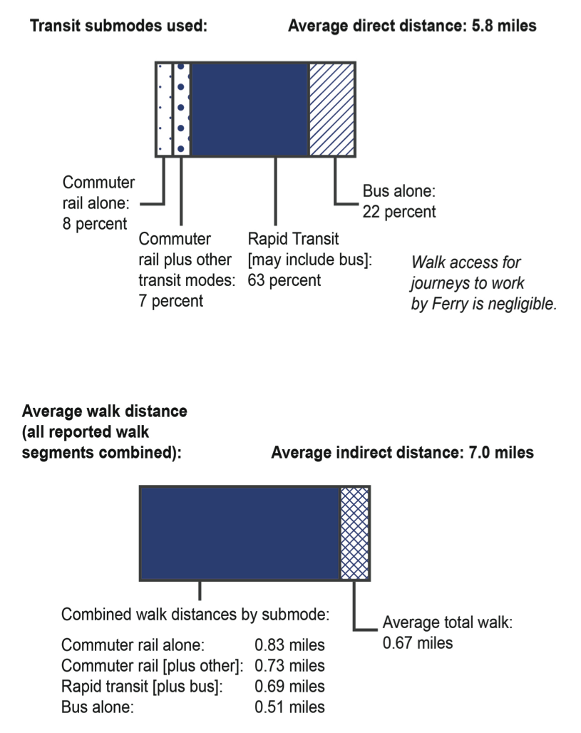
The WAT rectangle from Figure 10 is replicated at the top of Figure 15. This rectangle has been divided to represent the shares of each transit submode utilized, using the same submode definitions as in the DAT analysis. The rapid transit submode is by far the most important WAT submode. This is because the rapid transit lines serve the region’s densest employment concentrations, and most of the rapid transit stops are convenient to nearby residential areas.
Only 15 percent of WAT journeys to work involve a walk to a usually suburban commuter rail stop. At the work end of the journey, slightly more of the commuter rail users are able to walk directly to their workplace than require use of a connecting transit service.
The second, longer WAT rectangle in Figure 15 is scaled to represent the average indirect distance of seven miles, 1.2 miles longer than the 5.8-mile average direct distance. Respondents in the 2011-MTS were asked to report the location of transfers made between different transit services. The difference between average direct and indirect distances reflects the need of many commuters to travel into then out of downtown after changing at one of the downtown transfer stations.
The seven-mile indirect distance has been divided into two sections: a block representing the combined distances of all the reported transit segments and a block representing the combined distances of all the reported walk segments. The average combined walk distance for a WAT journey to work is 0.67 miles, which includes walking from home to transit, from transit to work, and any reported walking to intermediate activities.
The average WAT walk distance varies by submode; average combined walk distances by submode are summarized at the bottom of Figure 15. The average walk distance is greatest for commuter rail users, reflecting the lower suburban development density and longer average walk distances to reach a commuter rail stop. The average rapid transit walk distance is very close to the average because of the large share of WAT journeys to work using this submode.
The number of intermediate activities reported by WAT commuters equals about 15 percent of WAT journeys to work. This is a comparatively low number of intermediate activities, similar to their frequency with SOV commutes. Interestingly, 13 percent of these intermediate activities are reported as dropping someone off, possibly escorting a child to school, or the like. Getting something to eat represents 31 percent of these stops, shopping 15 percent, ten percent for recreation, and five percent work related. The remaining 27 percent are divided between other activity types.
The average WAT direct distance, 5.8 miles, is 0.9 miles longer than in 1991, when the average WAT commute was 4.9 miles. As with DAT, the longer average WAT commute distance was in part because of expansion and improvement of the commuter rail submodes.
Another factor contributing to lengthier WAT commutes has been an emphasis on transit-oriented development (TOD). The rapid transit system has not expanded at all since 1991, but a number of new multi-family housing developments have been constructed during this period near the outer stations of several rapid transit lines. Multi-family housing also has been constructed near suburban commuter rail stations, facilitating a number of especially long WAT commutes.
The non-motorized modes, walk and bicycle are presented together in this section. Using the definition of a journey to work as one from primary residence to primary workplace, walk and bicycle were used for 4.2 and 2.0 percent of the journeys, respectively, as shown in Figure 10. Journeys by bicycle are much longer than walk journeys (2.83 versus 0.62 miles). Taken altogether, bicycle journeys to work cover more than twice as many commuting miles than walk journeys.
Walk has been discussed already in this section as a connecting mode, notably for the DAT and WAT modes. Walk was also mentioned to a much lesser degree in the 2011-MTS as a connecting mode for SOV and HOV journeys to work. The importance of the Walk mode is best appreciated when all its contributions to daily journeys to work are considered together.
Figure 16 shows the six major modes in a manner similar to Figure 10, and the mode shares shown in the vertical axis are identical to those in Figure 10. The travel distances represented by the horizontal axis, however, are the indirect travel distances, which include all the individually reported journey segments. The average reported indirect distance for all journeys is 9.8 miles and is indicated by a dashed vertical line. The journey segments reported as walking are represented by the red rectangles at the left end of each mode rectangle. Use of the non-motorized modes is described here for each mode in descending order of total commuting miles.
The greatest non-motorized travel distance in journeys to work is generated by connections with the WAT mode. The 163,000 respondents commuting with this mode reported 373,000 individual walk segments covering 110,000 miles. The number of walk segments is more than twice the number of journeys because of the need to walk at both ends of the journey to work. The average total walk
FIGURE 16.
Walk and Bicycle: Journeys to Work and Connecting Segments
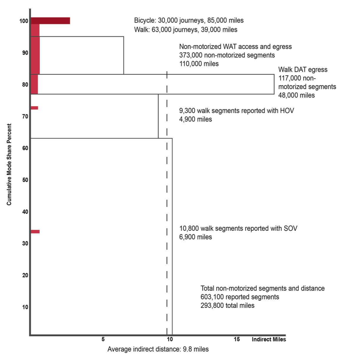
distance per journey is 0.67 miles. A small number of segments by bicycle are included in this calculation.
The second greatest non-motorized travel distance category is bicycles making the entire journey to work. The 30,000 respondents reported 34,000 segments, with a total travel distance of 85,000 miles averaging 2.83 miles per journey.
The 94,000 respondents using the DAT mode reported 117,000 walk segments totaling 48,000 miles, for an average walk distance of 0.51 miles.
The average distance for commuters walking from home all the way to work is 0.62 miles. Only 63,000 respondents report using this mode, so the combined travel distance is only 39,000 miles. The 63,000 journeys include 74,000 travel segments.
Included in the 925,000 journeys to work by SOV were 10,800 walk segments, often reporting activities on the walk from a remote parking location to the workplace. These reported segments totaled 6,900 miles, for an average distance of 0.64 miles per segment. These SOV-related walk segments also are shown in Figure 16.
The amount of walking reported as part of HOV commutes is close to the amount reported for SOV commutes: 9,300 walk segments totaling 4,900 miles, for an average of 0.53 miles per segment. There are far fewer HOV than SOV commutes, so these walk segments are significantly more important for completing HOV commutes than SOV commutes. Frequently, a driver will drop off a passenger a short distance from the final destination.
The work that informed this report began with the assumption that the flow of regional residents between their primary residence and their primary workplace is an important foundation for understanding all regional travel. Based on this assumption, a set of strictly defined regional travel data was created. This effort to define and understand the journey to work served as a basis for comparison between the 2011-MTS and 1991-HTS, and establishes an analytical framework that may be applied in subsequent studies of these surveys.
A few of the study findings that stand out are:
In identifying trip segments that formed journey-to-work trip chains, staff identified, but did not analyze, reciprocal journey-to-home chains. Staff also identified home- and work-based tours, i.e., those that both begin and end either at home or at work. Together, these families of trip chains represent all trips that were reported in the 2011-MTS. With much of the preliminary data preparation complete, staff now can undertake related follow-on analyses.
If the major classes of trip chains were organized and analyzed, further analysis might look at types of trips. For instance, what portions of shopping trips take place in a journey-to-work chain, journey-to-home chain, home-based tour, or work-based tour? Do these percentages differ by mode? Also, the survey provides the time duration of the activities. Are there patterns to the amount of time spent shopping depending upon mode or type of trip chain? Socioeconomic variables also may characterize aspects of these trip chains.
The 2011-MTS will be the basic survey tool for Massachusetts and the Boston Region MPO for the foreseeable future. We expect that this resource would consistently and accurately reveal state and regional travel patterns for years to come.
The endpoints of trip segments in the 2011-MTS were all characterized by precise coordinates, allowing reliable straight-line estimates of even short walk trip segments. In contrast, locations in the 1991-HTS were placed in one of 986 traffic-analysis zones and travel distances were calculated between the centroids of these zones. For longer-distance trips by motorized modes, reliable trip-length comparisons are still possible despite the difference in coordinate system detail. However, the many short walk distances reported in the 2011-MTS should not be compared with the zone-based distance approximations of the1991-HTS.